Nice selection! I agree with you on most of the covers!
–
You know, some of these covers would look really nice in a frame on the wall or as card size on the wall. Hmmmm….
Thanks Larissa
Maybe you could do a postcard.
Great choices, Wave. I wouldn’t argue with any of them. (For the sake of aesthetics, though, Liquid Silver needs to eliminate that prominent banner.)
*
What really strikes me is what talented graphic designers some authors are, like Jordan and Alex. Man, what I wouldn’t give for a sugar daddy who came into my life bearing gifts like Photoshop!
I usually don’t look at the covers much, especially when it comes to the authors I already know and like, but I’m glad two of my favorites are on your list – Shades of Grey and A Note in the Margin (and I just KNEW I forgot at least one book when I was making my best-of-2009 list, Rowan’s being one). Two great books and really, really lovely covers.
Lady M
I love both the book and the cover for A Note In The Margin. This book really affected me. Although Kassa reviewed Shades of Gray I loved it just as much and it’s great to sometimes have the book and cover match in terms of quality.
Hi KZ
I really loved your cover but you’re going to have to talk to LS about the banner.
*
Despite my Ugly Covers contests I can applaud artistic talent and genius when I see it. 😀
I sincerely like most of the covers; some are even downright amazing. It’s so impressive to see how far some small pubs have come with their covers. Very encouraging!
Though I must admit the hubs and I have been making lighthearted fun of one of these covers since we saw it last month. It’s completely absurd in the best possible way. 🙂
Kelli
I’m happy that you like the list. The quality of covers shows the incredible pool of talent out there.
*
I know that I make fun of the truly hideous covers occasionally with my Ugly Covers contests [and those are most deserving in a totally different way] 🙂 but it’s always great to be able to give praise where it’s due.
*
You must email me about the cover that you’ve been making fun of. I have an idea and if it’s the one I think it is, he’s pretty hot looking and I couldn’t resist. 😀
What a wonderful selection, Wave — although, for an angel cover, I think I prefer Wings (cover by Anne Cain). As Jenre commented in her review, I could look at that black-winged angel for hours.
–
I am particularly happy that Hidden Conflict made it on your list. If I can blow my own horn a little bit, I took the picture that is in the lower right hand corner. It’s at the American Cemetery in St. Avold, France.
–
Kelli, let me guess: you’ve had a few laughs about the Mistletoe Madness cover. I rolled my eyes the first time I saw it, but with all the giveaways this month, and seeing it every day, it’s grown on me and now I like it a lot.
–
L
All pretty amazing, as has been said, it’s great to see what small publishers can do with literally no budget.
–
And no headless naked torsos. Thank God.
–
There’s definitely been an upswing in the quality of covers in the last year, as more publishers realise that we DO want better quality, and we will take the piss out of shoddy work. And better covers sell better–my royalties definitely bear this out.
Hi Erastes
These are just covers for books reviewed here – imagine the wide variety available on the publishers’ sites. Definitely no headless torsos for me.
*
It was difficult for me to choose my favourites, although some of them, including the new Frost Fair cover, were a lock. I also had difficulty choosing between False Colors and Transgressions because I didn’t want to have both since they were so similar, and eventually I decided to go with the more ‘military’ look of the FC cover.
*
The artistic talent is certainly there, and if I have to have more “Ugly Covers” competitions to bring home the point that book covers are almost as important as the content, then I’ll continue to do so. 🙂
Leslie
It was a toss up between Wings and Flight and I knew that 50% of the readers would like the opposite of the one I chose. 🙂 but they are both beautiful.
*
Kelli has not emailed me but I think it’s between two covers and I love them both, for different reasons. 😀
*
The Hidden Conflict cover was a terrific piece of art – it was one of those that I came back to again and again. This year I have more variety than 2008 and I’m pleased that more historical covers were included, simply because they were so beautiful.
*sigh* So many pretties in one post. I agree with you on a lot of those, especially Captain’s Surrender, Frost Fair, Note in the Margin, Hired Man, Mistletoe Madness, Riddle of the Sands & False Colors. Two others I loved were Madelynne Ellis’ Pure Folly, Evangeline’s Str8te Boys and Mitchell’s Improper Holiday. I like the cover of Cameron Dane’s new release I Do a lot, too 😀
Hi Mary
They are all so pretty. Cameron Dane’s I Do is wonderful but I couldn’t put it on the list since it hasn’t been reviewed here as yet. Next year it will most likely make the list. 🙂
*
The others you mentioned were on my original list but I could only have 25 – sorry.
Kris
I do love the cover for Ice Cream on the Side. I went back and forth for 2 days and I’m still thinking of the ones that were left off. ICOTS is a very pretty cover – but then so are all of P.L. Nunn’s covers. I love the one for Drawn Together also. Another one I like is the cover for Disguises by E.M. Lynley, although that’s not by P.L.
*
The good thing is there are so many great covers I could just have easily picked 25 different ones which would have been just as beautiful.
Yowza! I’m so tickled you picked one of my PsyCop covers! I think I searched for hours for the perfect “X” to put in the background. Weird but true.
Jordan
You have 3 covers on the list and even though Hemavore is incredible, I love Criss Cross and Manikin as well.
Criss Cross is the cover I created myself, though. When I see a book cover like Kanaxa’s gorgeous Hemovore cover on a list I feel happy for her — but seeing my own cover art makes me happy for me 😀
Hi Jordan
I have always loved the Criss Cross cover. You are extremely talented – I had no idea that this was your own work. WOW.
$%(# computer ate my message. Grrr. Sigh, starting over.
*
I think you picked some great covers. Sometimes it’s really hard for me to say why I love a cover. I can be a headless torso I love on one book and hate on another. Sometimes a clothed guy, sometimes no guy at all. TA Chase had a free short with a Christmas ball on the cover and just the title in a nice font. I totally drool over that cover and not a man in sight. Color also works for me. AM Reilly’s Immortality is the Suck has a particular shade of blue that captivates me. So I can’t tell you what makes a good cover, but I’ll know it when I see it. 🙂
Tam
One of the things I love are unusual covers, and I tried to come up with a variety of different ones that spoke to me for a variety of reasons. I’m glad you liked most of them. They won’t all appeal to others, but for example, I couldn’t get the covers for Tigers and Devils and A Strong and Sudden Thaw out of my mind, no matter how much I tried. 😀 I do understand what you mean about the cover of Immortality is the Suck – sometimes it’s just the colour that appeals!
*
I must check out the cover of T.A’s Christmas short. 🙂
Nice cover choices (I really enjoyed A Strong Hand)…and some of the titles are rather interesting. I think I’m going to Google Shades of Gray 🙂
Orannia
This year most of the covers were on some truly terrific books. If you want to find out about Shades of Gray, Kassa wrote a wonderful review here http://www.gayromance.org/?p=11205
Great choices, Wave. I see quite a few of my favorites here. 🙂
Hey Lily
Whenever I do these I always feel that I left out an obvious excellent cover. But then I think – that’s what next year is for. 😀
Those are some nice covers. I really like the one for Bring the Heat.
Hi Tracy
I thought that Bring the Heat, both the cover and the book were very hot. 😀





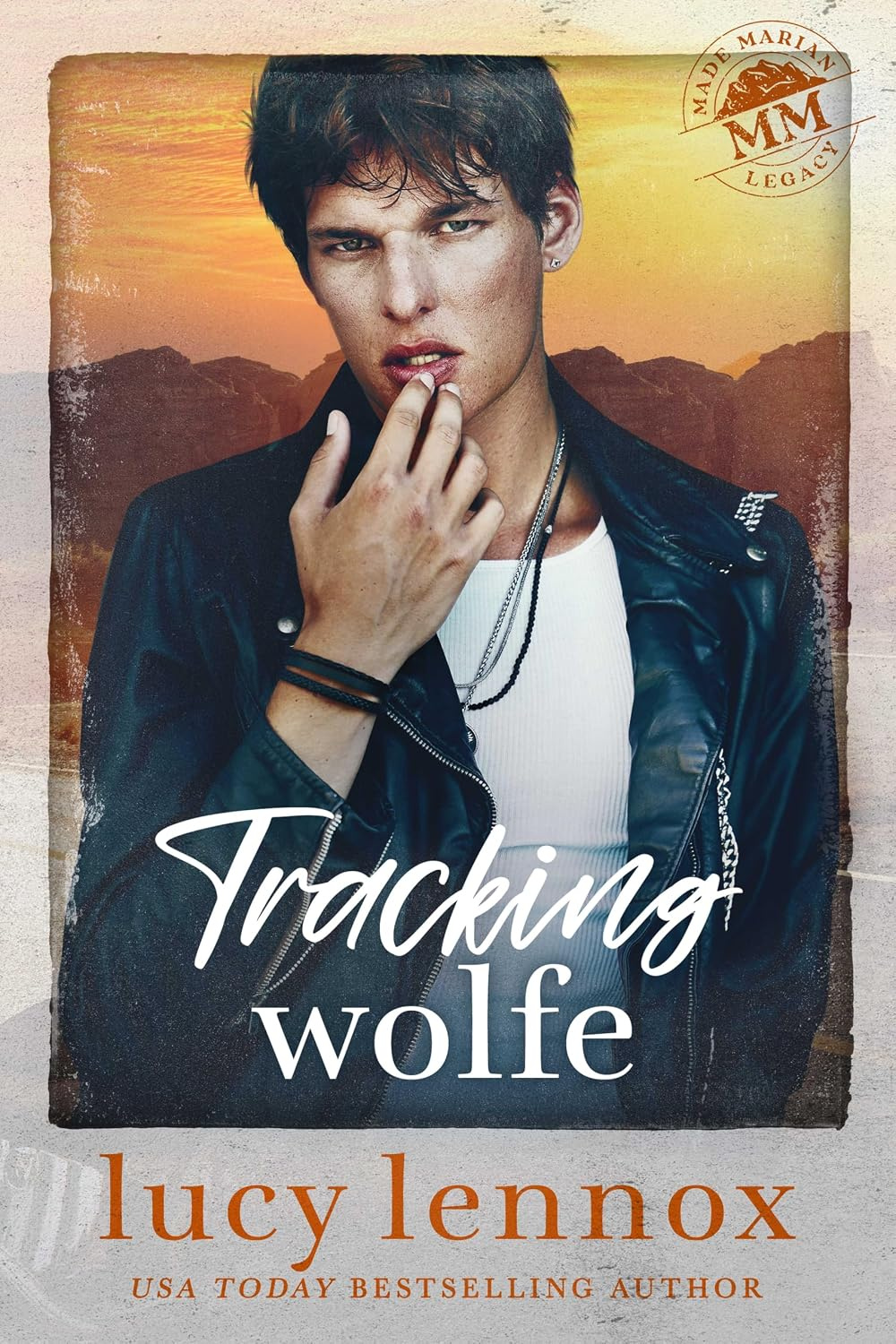









Nice selection! I agree with you on most of the covers!
–
You know, some of these covers would look really nice in a frame on the wall or as card size on the wall. Hmmmm….
Thanks Larissa
Maybe you could do a postcard.
Great choices, Wave. I wouldn’t argue with any of them. (For the sake of aesthetics, though, Liquid Silver needs to eliminate that prominent banner.)
*
What really strikes me is what talented graphic designers some authors are, like Jordan and Alex. Man, what I wouldn’t give for a sugar daddy who came into my life bearing gifts like Photoshop!
I usually don’t look at the covers much, especially when it comes to the authors I already know and like, but I’m glad two of my favorites are on your list – Shades of Grey and A Note in the Margin (and I just KNEW I forgot at least one book when I was making my best-of-2009 list, Rowan’s being one). Two great books and really, really lovely covers.
Lady M
I love both the book and the cover for A Note In The Margin. This book really affected me. Although Kassa reviewed Shades of Gray I loved it just as much and it’s great to sometimes have the book and cover match in terms of quality.
Hi KZ
I really loved your cover but you’re going to have to talk to LS about the banner.
*
Despite my Ugly Covers contests I can applaud artistic talent and genius when I see it. 😀
I sincerely like most of the covers; some are even downright amazing. It’s so impressive to see how far some small pubs have come with their covers. Very encouraging!
Though I must admit the hubs and I have been making lighthearted fun of one of these covers since we saw it last month. It’s completely absurd in the best possible way. 🙂
Kelli
I’m happy that you like the list. The quality of covers shows the incredible pool of talent out there.
*
I know that I make fun of the truly hideous covers occasionally with my Ugly Covers contests [and those are most deserving in a totally different way] 🙂 but it’s always great to be able to give praise where it’s due.
*
You must email me about the cover that you’ve been making fun of. I have an idea and if it’s the one I think it is, he’s pretty hot looking and I couldn’t resist. 😀
What a wonderful selection, Wave — although, for an angel cover, I think I prefer Wings (cover by Anne Cain). As Jenre commented in her review, I could look at that black-winged angel for hours.
–
I am particularly happy that Hidden Conflict made it on your list. If I can blow my own horn a little bit, I took the picture that is in the lower right hand corner. It’s at the American Cemetery in St. Avold, France.
–
Kelli, let me guess: you’ve had a few laughs about the Mistletoe Madness cover. I rolled my eyes the first time I saw it, but with all the giveaways this month, and seeing it every day, it’s grown on me and now I like it a lot.
–
L
All pretty amazing, as has been said, it’s great to see what small publishers can do with literally no budget.
–
And no headless naked torsos. Thank God.
–
There’s definitely been an upswing in the quality of covers in the last year, as more publishers realise that we DO want better quality, and we will take the piss out of shoddy work. And better covers sell better–my royalties definitely bear this out.
Hi Erastes
These are just covers for books reviewed here – imagine the wide variety available on the publishers’ sites. Definitely no headless torsos for me.
*
It was difficult for me to choose my favourites, although some of them, including the new Frost Fair cover, were a lock. I also had difficulty choosing between False Colors and Transgressions because I didn’t want to have both since they were so similar, and eventually I decided to go with the more ‘military’ look of the FC cover.
*
The artistic talent is certainly there, and if I have to have more “Ugly Covers” competitions to bring home the point that book covers are almost as important as the content, then I’ll continue to do so. 🙂
Leslie
It was a toss up between Wings and Flight and I knew that 50% of the readers would like the opposite of the one I chose. 🙂 but they are both beautiful.
*
Kelli has not emailed me but I think it’s between two covers and I love them both, for different reasons. 😀
*
The Hidden Conflict cover was a terrific piece of art – it was one of those that I came back to again and again. This year I have more variety than 2008 and I’m pleased that more historical covers were included, simply because they were so beautiful.
*sigh* So many pretties in one post. I agree with you on a lot of those, especially Captain’s Surrender, Frost Fair, Note in the Margin, Hired Man, Mistletoe Madness, Riddle of the Sands & False Colors. Two others I loved were Madelynne Ellis’ Pure Folly, Evangeline’s Str8te Boys and Mitchell’s Improper Holiday. I like the cover of Cameron Dane’s new release I Do a lot, too 😀
Hi Mary
They are all so pretty. Cameron Dane’s I Do is wonderful but I couldn’t put it on the list since it hasn’t been reviewed here as yet. Next year it will most likely make the list. 🙂
*
The others you mentioned were on my original list but I could only have 25 – sorry.
Funny. I was just saying on another blog that one of my fave covers of the year has to be P L Nunn’s original artwork for Wren’s book: http://www.loose-id.com/Ice-Cream-on-the-Side.aspx.
I love almost-kisses on book covers. 😀
Kris
I do love the cover for Ice Cream on the Side. I went back and forth for 2 days and I’m still thinking of the ones that were left off. ICOTS is a very pretty cover – but then so are all of P.L. Nunn’s covers. I love the one for Drawn Together also. Another one I like is the cover for Disguises by E.M. Lynley, although that’s not by P.L.
*
The good thing is there are so many great covers I could just have easily picked 25 different ones which would have been just as beautiful.
Yowza! I’m so tickled you picked one of my PsyCop covers! I think I searched for hours for the perfect “X” to put in the background. Weird but true.
Jordan
You have 3 covers on the list and even though Hemavore is incredible, I love Criss Cross and Manikin as well.
Criss Cross is the cover I created myself, though. When I see a book cover like Kanaxa’s gorgeous Hemovore cover on a list I feel happy for her — but seeing my own cover art makes me happy for me 😀
Hi Jordan
I have always loved the Criss Cross cover. You are extremely talented – I had no idea that this was your own work. WOW.
$%(# computer ate my message. Grrr. Sigh, starting over.
*
I think you picked some great covers. Sometimes it’s really hard for me to say why I love a cover. I can be a headless torso I love on one book and hate on another. Sometimes a clothed guy, sometimes no guy at all. TA Chase had a free short with a Christmas ball on the cover and just the title in a nice font. I totally drool over that cover and not a man in sight. Color also works for me. AM Reilly’s Immortality is the Suck has a particular shade of blue that captivates me. So I can’t tell you what makes a good cover, but I’ll know it when I see it. 🙂
Tam
One of the things I love are unusual covers, and I tried to come up with a variety of different ones that spoke to me for a variety of reasons. I’m glad you liked most of them. They won’t all appeal to others, but for example, I couldn’t get the covers for Tigers and Devils and A Strong and Sudden Thaw out of my mind, no matter how much I tried. 😀 I do understand what you mean about the cover of Immortality is the Suck – sometimes it’s just the colour that appeals!
*
I must check out the cover of T.A’s Christmas short. 🙂
Nice cover choices (I really enjoyed A Strong Hand)…and some of the titles are rather interesting. I think I’m going to Google Shades of Gray 🙂
Orannia
This year most of the covers were on some truly terrific books. If you want to find out about Shades of Gray, Kassa wrote a wonderful review here
http://www.gayromance.org/?p=11205
Great choices, Wave. I see quite a few of my favorites here. 🙂
Hey Lily
Whenever I do these I always feel that I left out an obvious excellent cover. But then I think – that’s what next year is for. 😀
Those are some nice covers. I really like the one for Bring the Heat.
Hi Tracy
I thought that Bring the Heat, both the cover and the book were very hot. 😀