
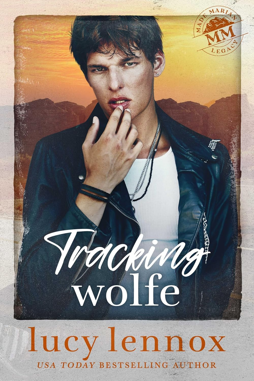
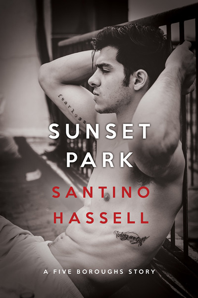
I’m definitely not an artist but I know what pleases me when I look at a photograph, a picture, or a book cover. So for the past 2 years I published my favourite book covers and I’m doing so again, in no particular order. Some of these covers you may think are strange but for me there is an strong attraction, and every time I look at them I’m drawn once more into their essence. So here are my Top Covers for books reviewed on the site this year, and each one is quite different. Of course I could have included another 25 and I’ll probably kick myself for not adding one or 10 more, but I had to stop. 🙂 I just added Fugly because I admit this was a heinous omission. My bad. lol. Which are your favourite covers?










Wonderful choices, and difficult to pick from them, but if I must I would go for:
Garhering Storm, A Deadly Game, Rain and Fair Game 🙂
*Something that I find weird about covers is when the same boys shows up in different covers/stories: if I got them identified with a character in particular, my first impression is that they are out of place* 🙂
Hi Helena
These covers impacted me for different reasons – Gathering Storm – I couldn’t walk away from it; similarly with A Deadly Game and Rain.
I think the publishers need to find different stock photos of men for these covers – some of them are looking pretty tired now that we have seen them so many times.
I really liked Angel 1089. Jet Mykles Reindeer Games was cute and fun too.
Lovely covers all of them, but Resistance, Gathering Storm and Between a Rock and a Hard Place are different enough to deserve another look. ^^
Hi Lady M
Aren’t they gorgeous. When I saw the cover of Resistance I so hoped that the book would rise to the level of the cover and it sure did. Gathering Storm has such impact I couldn’t resist it and the cover of Between a Rock really tells the story of the book. Thank you for seeing some of what I coulnd’t look away from.
Wave, these are excellent choices. Among them are both some of my favorite covers and favorite books.
Rain, Resistance, At Piper’s Point, Fair Game and Captive all make me want to dive into the story behind the men. (And I have, with the exception of Captive.)
In the Flesh is so perfect for Cristian’s character since, while he’s out and proud, he also keeps so much of himself hidden in the shadows. And, of course, I can’t look at the cover for The Trap without going back to that place in my mind (usually somewhere around the hot tub scene, lol). Both of these are special to me for obvious reasons.
Wait…did you do that Canadian counting thing again?? 😉
Buda
Why do you always have to expose me? No one else noticed and let that be our little sekkrit.
I love them all obviously but Resistance, APP, Captive, In the Flesh and The Trap are some of my absolute faves. Thank you for seeing them through the eyes of a non artist. (I can so count … well mostly) 🙂
Aww, that’s okay, Wave. I’d rather diagram sentences all day than have to count or perform any other mathematical functions. It’s your site. If you say 28 is the new 25, then so be it! 🙂
I like :
Gathering Storm
Resistance
Talker
Hi Bogusia
those three covers are excellent choices. Thank you.
Nice list! Cover art is something I always take note of – must be the frustrated artist in me 😉 It’s something I miss with the Kindle but I see now some of the newer e-readers have color?
I really love the work on The Glass Minstrel and Talker. I have not read Resistance, Captive, or Dark Designs but the cover art alone makes me want to! The cover of Home Is The Sailor really captures the setting of the story. Every time I see the cover of Fish & Chips with the “welcome on board” I add “the love train” in my own thoughts, because that’s sort of where Ty and Zane end up at the end of the book. OK, so I’m whacky….
Other favorite covers of mine: The Christmas Throwaway by RJ Scott (the covers of all her books are stunning), His For The Holidays anthology, Duty & Devotion by Tere Michaels,
Out of Bounds by Viki Lyn and Trust Me If You Dare by LB Gregg (Ce and Dan in stubble smirking away just makes me smile). I also love the new cover on Alex Beecroft’s Captain’s Surrender and the new cover art on Ally Blue’s Bay City Paranormal series.
Hi Dianne
The cover for Captain’s Surrender was on last year as one of my favourites, and I love all of Ally’s new BCPI covers, but the rule is that the books had to have been reviewed on the site last year, so they didn’t qualify.
Dark Designs I think is just wonderful and the artist really captured the story. As for The Glass Minstrel – as soon as I saw the cover I knew it would make the list. All of the others really do capture the stories as well and every time I see F & C I want to burst out laughing.
Thank you for dropping by.
Dianne T, the Trust Me If You Dare cover makes me want to pick it up time and again. Then I remember it’s not a picture book and those boys are only on the cover. Sorta breaks my heart. 😉 It’s the same reason I hate clothes shopping. Why can’t I order the models?!?!
Buda, My mind usually forms its own picture of the characters in stories but…. yeah, the guys as pictured on Trust Me sure work – and I confess to a stubble fetish 😉
Hello Dianne T.,
Thank you for mentioning The Christmas Throwaway and for commenting on “all” of RJ’s covers. 🙂 It’s truly a pleasure to work on her art.
And thank you, Wave. For including Talker in your top list. I’m glad there’s been so much ‘talk’ about Talker. It’s definitely gotten attention. I’m anxious to see if the sequel’s cover art (out this month) will receive the same reaction.
Reese
I had no idea that the cover for The Christmas Throwaway was also your art. That’s a gorgeous cover and so different from Talker. Did you do all of RJ’s covers? The artwork on Moments is so remarkable that almost everyone has mentioned it when they checked out the review. 🙂
I love the cover for Talker because it’s so vibrant and wonderfully different and reflects what the story is all about. Very rarely does that happen, and you shold be applauded for going against the conventional type of cover. I just saw the cover for Talker’s Redemption which is another fine piece of work. Congratulations.
Hi… It is like Reese can see inside my head and produces the most awesome pieces of art…
I, and the other authors at Silver, are so very lucky to have her…
Rj x
Hi Reese,
I am so glad you saw this thread and are commenting. A few days ago I went to your site and saw how many covers you actually had done – Wow! I see The Nightporter, which was just reviewed here today is graced by one of your covers. Your work is captivating, inspiring and absolutely contributes to the stories and characters inside the covers. As someone who has always loved drawing and creating watercolor paintings, I enjoy seeing beautiful artwork, and seeing someone being able to pursue their art as a career is very satisfying. Here’s to your continued success. I’m anxious to read, and of course see, Talker’s Redemption. (Thanks Wave for supplying the title…….I couldn’t remember what it is!)
Wave,
Thank you 🙂
Yes, thus far, all of RJ’s releases thru Silver Publishing (Oracle, The Christmas Throwaway, Moments and Kian) are my designs including her upcoming contemporary story, The Heart of Texas, due out next month. Thanks for the feedback on Talker’s Redemption’s cover. I try to show a variety in my work and I’m always open to new techniques.
Dianne T.,
Wow, thank you! Yes, The Nightporter is one of my designs as well. I can’t fit them all on my website but that’s a good sampling/mix, I think. I love what I do and I’m so glad it shows in my work.
Just so damned proud of you and the art your create Reese… x
Hello Dianne…
Thank you for your continued comments on my wonderful covers… I am so lucky to have Reese Dante at Silver creating such beautiful designs…
My next cover design from Reese is for my Earthquake/Forest Fire story – I can’t WAIT to see that one…
Hugs Rj x
Really nice choices Wave. A lot of these are covers that made a real impression on me as well. It’s so hard to just look at the covers and not think about the wonderful stories that lie beneath.
Some of my favorites are Resistance, At Piper’s Point, The Dickens With Love, The Keeper and of course Illustrated Men, although it’s probably unfair to pit Michael Breyette’s work against any of these!
And hey 25, 28, what’s a few extra covers among friends? 😉
Tj
What is it with you and Buda that you have to try and out me? It’s a Canadian thing, OK? 🙂
Needless to say, I love everything on the list and I could have gone on for another 25 or 28. lol
Resistance is so ethereal that I knew the story would match. As for APP, that’s my fave Ethan Day cover. Micahel Breyette’s art speaks for itself and all the others, especially The Keeper, are ‘keepers’.
“What is it with you and Buda that you have to try and out me? It’s a Canadian thing, OK?”
Well we do convert money between the countries, so why not everything else too? Will I have to wish for 2 Canadian Mounties for Little Christmas now – or will I end up in a threesome? LOL
Teej – Either way you do the conversion, it sounds like a win/win to me!
Teej
You wish! For someone not into threesomes you sure speak with forked tongue. lol.
Our dollar is on par so you don’t have to convert except for those stupid banks taking their ‘cut.’ Yet another unkind cut. 🙂
LOL Good one Wave – you do amuse me so. Now I’m not opposed to threesomes in theory, it’s more the idea of getting my middle aged butt nekkid in front of 2 guys is enough to make me break out in hives! I’m sure they’d both decide that they were way hotter than me and completely forget I was even in the room.
hi Wave,
Talker by Amy Lane is by far my favorite cover. It captures my eye every time. Beautiful compliation. 🙂
~Amy
Hi Amy
I thought that the cover of Talker was stunning. that was why I wanted to review the book – to read the story behind such incredible artwork.
Very nice covers, loved Joshs’ “A Vintage Affair” & “Icecapade”, as well as JCP with the “Petit Morts” series.
I wasn’t too crazy about the “Talker” cover.
I also liked Scarlett Blackwells “Just Desserts” & “Second Helpings”, GREAT books also in case anyone has not read them yet.
I adore Luc!
Also liked:
“Death by Misfortune” by AM Riley
“Black Cat Ink” by Nicole Kimberling
I bought “Resistance” because the cover caught my eye, covers are so important for getting attention, good & bad.
Hi Rdafan7
Isn’t it amazing how many of us buy books because of the covers? I wish more publishers would recognize how important they are in promoting their authors’ books. Like you I loved both Just Desserts and Second helpings – what a great way to showcase the book and the theme.
Talker takes some gettng used to but that’s what first attracted me to the book and it definitely reflected Tate’s character. 🙂
Wishink Well is unique, my favorite on this list along with At Piper’s Point. Sleepwalker is my favorite but it’s not on the list. It has similar coloring as Between a Rock and A Hard place. I like that one too.
Stella
Sleepwalker is also a favourite but I didn’t remember until I had already posted this and I was over my limit as Tj and Buda pointed out. 🙂 Let it be said that I regret not including Sleepwalker – maybe I will when no one’s looking.
Since you added Fugly, your list is lopsided. Better go ahead and add the other one, too. Otherwise I’m going to be looking at you funny…. 🙂
Thank you Buda! I was thinking the same thing. It looks like the whole stack of book covers are gonna come tumbling down with only one at the bottom!
Are you counting? I was hoping to sneak in the other cover when you weren’t looking. Damn! You noticed Fugly so I have no choice but to continue my Canadian counting. 🙂
Wave you are completely out of control. Just step away from the computer and STOP ADDING COVERS!!. 25 is now a just distant memory. LOL
I’ve stopped reading the comments and I promise NO MORE. I only added one. *giggle* YOU have to look away and I’ll step away. This is such fun. Canadian counting is so much better than American. 🙂
LMFGAO @ TJ! You tell her, son!
Sometimes YOU need to just look away. 🙂 This is all your fault and Teddypig’s who harangued me about Fugly, and then you said the covers would come tumbling down if I didn’t add one more to balance it. lol. I’m off to bed and I’m not looking at the comments any more.
Woo hoo, my illustration for Wishink Well made the list! Thank you 😀
My favorite here is Captive–look at that clever use of shadow behind the title, and Strawberries for Dessert, again for the typography. I love typography.
Jordan
Every year when I do this I promise not to do so again because everyone kicks my butt about the ones I forgot. lol. I love Sleepwalker but by the time I remembered it I was over my limit of 25. As I told Stella – maybe I’ll sneak it in when no one’s looking. 🙂 I’m glad you liked at least a couple of my picks and you know how much I love the Petit Morts covers.
I also liked the cover for “No Rest for the Wicked” from A.M. Riley.
For a change not the image of a man from the front, works well with the colors used.
My favorites from those above are A Deadly Game and Between a Rock and a Hard Place, mostly because they tell you a bit about the stories without giving anything away. 🙂
For myself, my favorite covers were Fugly and Fall of a State. I don’t care for the “torso” covers too much. (Although I did really like the Oracle cover by RJ Scott.)
Kirsten
I have since included Fugly because that was one I truly overlooked, and not intentionally. Also JCP’s Sleepwalker is another one I overlooked. There are so many excellent covers every year that I could not possibly capture them in the 25 or so I publish. Thanks for mentioning a few covers that were also beautiful.
My favourite cover this year has been Fugly by KZ Snow. It so perfectly captured the theme of the book.
I confess to a leaning towards drawn rather than photographic covers, often because they avoid the headless torso covers that I’m never very fond of – although I have to say that the cover for Rust Belt by Jessica Freely was very nice for a torso cover and is perhaps my favourite of that type for the year.
I loved the Petit Mort covers for their vibracy.
Anything by PL Nunn with have me tempted to press the ‘buy now’ button too :).
Jenre
You are absolutely right about Fugly and a couple of others have commented about it as well. I don’t know how I missed it but I’ve since added it. I’m now up to almost 30 covers – as the boyz say, it’s Canadian counting. lol
You’ve got a few of my faves there – Gathering Storm especially. I also loved Miles and the Magic Flute, Rust Belt, Fall of a State and Petit Morts.
I’m usually drawn more to photographic covers, but not the headless torsos. I like interestingly cropped images with a restricted colour scheme and bold fonts. Drawn artwork is harder to get right for me, but when it does it’s the best 😀
Jo I love the photographic covers like Michael Breyette’s. I’m not fond of the headless torsos unless there is a lot more to the picture such as The Trap and A Vintage Affair which really says it all about the books.
The above 25 titles are a great cross section of the standouts. Thanks for doing this reguarly and thoroughly. I’m always curious to see if my faves are represented in yours, and boy were they! 🙂
This past year Gathering Storm, Fugly, Just Desserts, At Piper’s Point really stood out for me… and all are present and accounted for! Marketing appeal is such a subjective thing, but these examples all capture something of the story inside and all demand a lingering eye. Two for two, says me.
Facinating to watch the industry evolve and mature. Over the past 3 years, the arc of increasing sophistication has pretty clear. From what I can tell, publishers and readers are starting to take some design risks. It puts me in mind of your recent thing about the splintering of the genre into distinct subspecies. The Fair Game cover above is classic thriller but WIshink Well has all the wit and sass of a George Baxt mystery. It feels like the design is following the divisions, which is as it should be.
After pondering your choices, I think (at long last) we have abandoned the spate of creepy Poser covers. Huzzah! And I too am getting a little weary of the depilated headless torso against a neutral saturated background. I understand WHY they work, but it’s getting harder and harder for people to do somethign fresh with a limited pool of stock photos. Generic input often means generic output, and in genre fiction that’s the kiss of death. How far can the designers and artists push the idea of M/M covers and still appeal to readers old and new?
Really excited to see what the list for 25 Best of 2011 will look like.
Hi Damon
I love the covers on the books today. They are beautiful and dynamic and I’m so pleased that the publishers are hiring actual artists rather than using stock photos on ebooks.
Poser covers are ugly and I hate them.
On March 23rd I’m interviewing Reese Dante who is one of the new breed of artist in the epublishing industry so I hope you will check out the site then.